Comparison of Adobe RGB and sRGB Colors

Two of the most commonly used ICC profiles for RGB images are Adobe RGB (1998) and sRGB IEC61966-2.1. The Adobe RGB (1998) color space has a larger color gamut than the sRGB IEC61966-2.1 color space, but you may be surprised to see that they share many similarities.

In order to compare the two color spaces, I will use the CIE and ICC data that define the color spaces:

  1. Gamma value
  2. White point
  3. Red primary CIE chromaticity coordinates
  4. Green primary CIE chromaticity coordinates
  5. Blue primary CIE chromaticity coordinates

Adobe RGB and sRGB attribute values

As you can see in the table, Adobe RGB (1998) and sRGB IEC61966-2.1 share the same values for four of the five attributes. The only difference is the set of CIE chromaticity coordinates for the green primary.

Now let me show you two versions of a sample image. For the first image, the sRGB IEC61966-2.1 ICC profile was assigned to the image in Adobe Photoshop. For the second image, the Adobe RGB (1998) ICC profile was assigned to the image in Adobe Photoshop. (Note: To make sure you see a difference between the two images, I converted the second image from Adobe RGB (1998) to sRGB IEC61966-2.1 so that both images are coded to the same color space. Yes, I could have coded both of them in the Adobe RGB (1998) color space to make sure no colors got clipped. Feel free to repeat this experiment in a color-managed display environment to see the color differences.)

sRGB IEC61966-2.1 ICC Profile
food image sRGB

Adobe RGB (1998) ICC Profile
food image Adobe RGB

As you can see, the colors in the image with the sRGB IEC61966-2.1 ICC profile are significantly different from the colors in the image with the Adobe RGB (1998) ICC profile.

Based on the data comparison above, I would have expected the reds and blues to be similar in both images, and I would have expected the greens to be very different. However, the greens and blues have small shifts in color, and the reds and oranges have large shifts in color. Here is another set of images that demonstrates the color differences.

sRGB IEC61966-2.1 ICC Profile
park slide image sRGB

Adobe RGB (1998) ICC Profile
park slide image Adobe RGB

Why do we see these large color differences in the reds and oranges when the only difference in the two color spaces is the set of CIE chromaticity coordinates for the green primary? The answer can be found in the CIE XYZ tristimulus values for the red, green, and blue primaries.

sRGB IEC61966-2.1 CIE XYZ Tristimulus Values
sRGB CIE XYZ tristimulus values

Adobe RGB (1998) CIE XYZ Tristimulus Values
Adobe RGB CIE XYZ tristimulus values

The two color spaces share the same CIE chromaticity coordinates for the red and blue primaries, and share the same D65 white point and 2.2 gamma value, but the two sets of CIE XYZ tristimulus values are completely different.

To fully understand the differences when the images are viewed with proper color management, we have to look at the 3×3 matrix in the ICC profile. As I described in an earlier post, a chromatic adaptation transform must be applied to the CIE XYZ tristimulus values to force the 3×3 matrix to deliver the D50 white point that is required in the specification for ICC profiles. For the Adobe RGB (1998) and sRGB IEC61966-2.1 ICC profiles, the Bradford transform and proper von Kries scaling were used to move the white point from D65 to D50. The CIE XYZ tristimulus values in the 3×3 matrices are shown below.

sRGB IEC61966-2.1 ICC Profile 3×3 Matrix
sRGB ICC 3x3 matrix values

Adobe RGB (1998) ICC Profile 3×3 Matrix
Adobe RGB ICC 3x3 matrix values

The CIE XYZ tristimulus values in these two 3×3 matrices help explain the color shifts seen in the two sets of example images. Further analysis can be done with these two matrices to compare the CIELAB values associated with a given set of RGB pixel values.

The point of this post is to alert people to be careful when comparing color spaces in color managed workflows. It is convenient to compare RGB color spaces based on the CIE chromaticity coordinates of the primaries, but it is difficult to predict the color differences in color-managed images from a comparison of CIE chromaticity coordinates of the primaries.

Post written by Parker Plaisted

References:
International Color Consortium, ICC Profile Format Specification, http://www.color.org

M. Fairchild, Color Appearance Models, Addison-Wesley, Reading, Massachusetts (1998).

Bruce Lindbloom Website, RGB Working Space Information page, http://www.brucelindbloom.com

Chromatic Adaptation for Display Profiles

When I was working on improvements to the OptiCAL software in 1998, one of the challenges was the selection of the chromatic adaptation algorithm. At the time, the International Color Consortium (ICC) did not specify a chromatic adaptation algorithm, so each software developer could choose any method for chromatic adaptation.

Let me back up and give you a little more context for this issue. The ICC had specified CIE D50 for the white point of the Profile Connection Space (PCS). Therefore, all the color coding in the PCS had to have a white point of D50. That worked well for output profiles (e.g., printer profiles), but it created an extra step in the creation of display profiles (e.g., monitor profiles) and RGB color-space profiles when the native white point was not D50. That extra step was the application of a chromatic adaptation transform.

I will focus on an ICC display profile for a color monitor as an example. When the display profile is based on the matrix structure, rather than the LUT structure, the 3×3 matrix contains CIE XYZ tristimulus values for the red, green, and blue primaries. By following the rules of linear algebra, the sum of each row in the 3×3 matrix produces the CIE X, Y, and Z tristimulus values for the white point of the display (i.e., the sum of the top row delivers the X value, the sum of the middle row delivers the Y value and the sum of the bottom row delivers the Z value). To be compliant with the ICC specification, the 3×3 matrix must deliver the CIE XYZ tristimulus values of D50 for the CIE XYZ tristimulus values of white (i.e., white XYZ for the display profile = CIE D50 XYZ).

If the white point of the actual display is not D50, then a chromatic adaptation transform must be applied to the measured data to force the 3×3 matrix to deliver the CIE XYZ tristimulus values for D50. (Keep in mind that a display will rarely be calibrated to exactly D50, so a chromatic adaptation transform will be applied to the measured data even for a small deviation from D50.) In simple terms, the chromatic-adaptation transform changes the tristimulus values of the red, green, and blue primaries to produce a D50 white from the sum of the three primaries. The new tristimulus values for the red, green, and blue primaries are placed in the 3×3 matrix for the display profile.

Without a specification from the ICC for a chromatic adaptation algorithm (CAT), software developers were free to choose any chromatic adaptation algorithm. Some software developers simply used linear scaling on the measured CIE XYZ tristimulus values for the red, green, and blue primaries to force them to deliver the CIE XYZ tristimulus values of D50 for white. This technique is generally referred to as a “wrong von Kries transform” and the results are inferior to a proper von Kries transform. In 1998, the two popular chromatic adaptation transforms were the Hunt Pointer Estevez transform and the Bradford transform. Each of these three methods (i.e., linear scaling of the XYZ values, von Kries scaling with the Hunt Pointer Estevez transform, and von Kries scaling with the Bradford transform) produced different sets of XYZ tristimulus values for the 3×3 matrix, and, in turn, delivered different colors when used in a color management pipeline. At the time, most people using color management were unaware of this little detail in display profiles, and to this day I still encounter “color management experts” who are not aware of this little detail. Fortunately the ICC addressed this issue and now recommends the Bradford transform for Version 4 of the ICC profile specification. Software developers who create software applications that make ICC profiles should now use the Bradford transform in the software in order for the ICC profiles to be compliant with the Version 4 specification, but exceptions are allowed and can be implemented in the ICC profile and noted in the chromatic adaptation tag in the ICC profile. Let me quote Annex E in Specification ICC.1:2010 (Profile version 4.3.0.0):

The ICC profile format specification allows the use of different linear (matrix-based) CATs. This flexibility allows profile creators to select the most appropriate CAT for their applications. Criteria for selection include visual performance, the gamut of the image as transformed to the PCS, and other considerations. However, the use of different CATs will produce different results, which may be undesirable. Therefore, it is recommended that the linear Bradford CAT be used when there is no reason to use a different CAT. The linear Bradford CAT has been widely implemented in the digital imaging industry, with demonstrated excellent visual performance. If a profile creator decides to use a CAT other than linear Bradford, they should do so only to address specific known issues, recognizing that the resulting profile will most likely produce different results than profiles from other sources.

In 1998 I chose the Hunt Pointer Estevez transform based on discussions with colleagues who had significant experience with chromatic adaptation transforms (CATs) and were familiar with the Hunt Pointer Estevez transform and the Bradford transform. Working with Dana Gregory on the OptiCAL software, we implemented the Hunt Pointer Estevez transform for OptiCAL version 2.5. Five years later in 2003, the OptiCAL software was updated to use the Bradford transform for chromatic adaptation to conform to the Version 4 ICC Specification. The update to the OptiCAL software that incorporated the Bradford transform was clearly the right decision, and Michael Brill provided a detailed report on this update to the software in 2003.

I hope this post will elevate awareness of the presence of a chromatic adaptation transform in software that produces display profiles. I will visit this topic again in future posts to share additional insights on related issues that may be overlooked in color management workflows.

Post written by Parker Plaisted

References:
International Color Consortium, ICC Profile Format Specification. (http://www.color.org)

M. Fairchild, Color Appearance Models, Addison-Wesley, Reading, Massachusetts (1998).

Monitor Calibration: D65 White Point for Soft Proofing

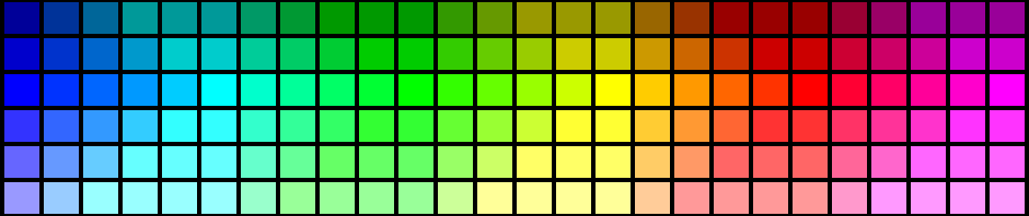
If you buy a color computer monitor today, connect it to your computer and display a photographic image on it you will probably be happy with the appearance of that image on the monitor. The monitor will use LCD technology and have a native white point near the CIE D65 standard. Right out of the box, with no external calibration, the monitor will display photographic images that look good—not perfect, but good. This is very different from the “out of the box” experience for a color computer monitor 20 years ago.

Let me go back in time to describe a few issues that led to a debate on the “right” white point for monitor calibration and highlight some interesting research from Dr. Mark Fairchild on chromatic adaptation for soft proofing on computer monitors in prepress workflows. The results of Dr. Fairchild’s research are also valid for digital photography workflows.

Before we had color computer monitors we had color television sets. The technology that enabled color television was an impressive merger of electrical engineering and color science. In 1953, the National Television System Committee (NTSC) released a standard for color television that included a white point specified as CIE standard illuminant C, which had a correlated color temperature of 6774 K. The NTSC standard for television established CIE standard illuminant C as the preferred white point for images viewed on a color television, which was at that time based on cathode ray tube (CRT) technology.

Eleven years later, in 1964, the CIE recommended D65 as the main standard daylight illuminant, and the popularity of CIE standard illuminant C faded away. This shift to D65 was summarized by Wyszecki and Stiles: “In practice, illuminants B and C have already fallen into disuse in most applications. Instead, CIE standard illuminant D65 is now widely used as the representative of average daylight for colorimetry.” (p. 145)

Based on the recommendation from the CIE and other scientific research, D65—with a correlated color temperature of 6500 K before 1968—became the preferred white point for calibrated video systems including PAL and SECAM, which are analog encoding systems for color television that were implemented in the 1960s.

In the 1960s and 70s, calibrated video systems were synonymous with closed-loop systems. With the personal computer revolution in the 1980s, we began to see the color monitor as a component of a computer system that could be purchased separately and from a different vendor than the computer. In such a system, the color monitor was out of the color calibration loop.

In the 1990s desktop publishing gained acceptance as the computer hardware from Apple Computer and the software from Adobe Systems and other companies enabled professional quality results in prepress workflows. At this time, color monitors were based on CRT technology, and the native white point for a typical full-color CRT monitor was near a correlated color temperature of 9300 K. Therefore, color illustrations and photographic images seen on a full-color CRT monitor had a very strong blue color cast that was not visible in a printed version of the electronic file. The open-loop systems created by connecting the separate components left us with an image displayed on a CRT monitor that did not look like the image rendered in a print.

There was a strong desire, and economic incentive, to judge an image on a color monitor to reduce the time and cost of making prints for the same judgment. The concept of a “soft proof” viewed on a color monitor rather than a “hard proof” seen in a print quickly became a goal for people working in prepress workflows with personal computers. The color monitor was the weak link in the system that prevented an accurate soft proof. There was universal agreement among printing, prepress, and color science experts that the white point of the color monitor had to be calibrated to a lower color temperature to solve the problem, but there was disagreement on the choice of the best white point for monitor calibration.

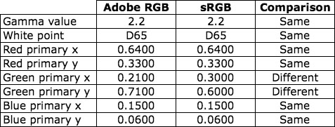
Two white points were proposed: D65 and D50. The set of chromaticity coordinates for CIE standard illuminant D65 was the standard white point for CRT-based color video systems, with roots in color television. CIE standard illuminant D50 was the standard illuminant for viewing prepress proofs in a professional printing workflow.

On one side of the debate was the evidence that a CRT-based video system calibrated to a D65 white point delivered an image with whites that appeared white. On the other side of the debate was the set of standards and established practices where D50 was the specification for illuminating prints. And the divide between these two white points was significant because research on visual adaptation indicated that a D50 white and a D65 white were far enough apart to be visibly different when viewed side by side and in the same method of rendering (e.g., two side-by-side images on a color monitor).

There were two factors that established D50 as an anchor in this debate: 1) the people who wanted to calibrate the monitors for soft proofing were working in digital prepress workflows with the goal of preparing files for a printing press, and 2) the established and universally adopted standard for viewing proofs in the printing industry was not going to change to D65 to accommodate this new idea of soft proofing. Therefore, color monitors in a prepress workflow were destined to be calibrated to a D50 white point unless someone could show that an image on a print illuminated with D50 light looked like the same image displayed on a color monitor that had been calibrated to a D65 white point—a theory that was inconsistent with our basic understanding of colorimetry because D50 and D65 chromaticity coordinates are too far apart to achieve a visual match between two corresponding white fields when viewed side by side and in the same method of rendering.

To give you some perspective on this, the CIELAB coordinates of the CIE tristimulus values of D65, with a reference white of D50, are L*=100, a*=-2.4, and b*=-19.4. Therefore the Delta E between the CIE tristimulus values of D65 and D50 in CIELAB space with a reference white of D50 is 19.5. That is a very large Delta E number, which indicates a large visual difference.

Scientists around the world took up the soft proofing challenge and conducted research on chromatic adaptation to images displayed on a color CRT monitor in comparison to printed images displayed in a light booth under D50 illumination. The scientists quickly identified environmental factors that influenced chromatic adaptation when people viewed images on a color monitor (e.g., the ambient light in the room). But one of the most interesting factors was explained in an article written by Dr. Mark Fairchild at RIT. In this article, published by TAGA in 1992, Dr. Fairchild described sensory and cognitive mechanisms in chromatic adaptation. The sensory mechanisms are consistent with the science of colorimetry. The cognitive mechanisms explain how our knowledge influences our perception of color.

The cognitive mechanisms in chromatic adaptation enable an observer to discount the yellow tint cast by D50 illumination on white paper and see the paper as white. This explains why D50 illumination for contract proofs has worked very well for the printing industry for decades. Unfortunately, the cognitive mechanisms in chromatic adaptation do not deliver the same benefits for images viewed on a color CRT computer monitor. To quote Dr. Fairchild:

When hard-copy images are being viewed, the image is perceived as an object that is illuminated by the prevailing illumination. Thus both sensory mechanisms that respond to the spectral energy distribution of the stimulus and cognitive mechanisms that discount the “known” color of the light source are active. When a soft-copy display is being viewed, it cannot easily be interpreted as an illuminated object. Therefore there is no “known” illuminant color and only sensory mechanisms are active.

Dr. Fairchild also noted in his research that chromatic adaptation was incomplete for observers who viewed a white patch displayed on a computer monitor with chromaticity coordinates near CIE illuminant A (incandescent light). To the observers, the white patch on the computer monitor retained a yellow appearance. If the observers were able to fully adapt, the patch would have appeared achromatic after complete chromatic adaptation.

Scientific research has shown that D65 is a good white point for color displays, including televisions and color computer monitors. Research has also shown that a color computer monitor calibrated to a D50 white point would retain a yellow appearance—chromatic adaptation would not be complete.

The solution for soft proofing started to become clear. The printing industry would continue to use D50 illumination as the standard for viewing contract proofs. The graphic artists would use color CRT monitors calibrated to a D65 white point because the D65 white point would allow them to achieve complete chromatic adaptation. However, in order for this to work, the image on the monitor could not be directly compared to a print under D50 illumination in a side-by-side viewing environment. The observer would have to have time to fully adapt to each separate viewing environment.

Therefore, the right white point for monitor calibration is D65 in order for the viewer to achieve complete chromatic adaptation to the color monitor based on sensory mechanisms in human vision—cognitive mechanisms are not active. Since cognitive and sensory mechanisms are both active when a print is viewed, the viewer should not directly compare a print to an image on a computer monitor when the white point for the illumination of the print is different from the white point of the color monitor.

Post written by Parker Plaisted

References:
G. Wyszecki and W. S. Stiles, Color Science: Concepts and Methods, Quantitative Data and Formulae, John Wiley & Sons, New York, N.Y. (1986).

Colorimetry, second edition. CIE Publication 15.2 (1986)

M. D. Fairchild, “Chromatic adaptation to image displays,” TAGA 2, 803-824 (1992b).

Monitor Calibration: D65 or 6500 K?

In my earlier post, I explained why the CIE standard illuminant D65 has a correlated color temperature (CCT) of 6504 K, not 6500 K. This is a trivial difference that is generally not perceptible, but it has led to some confusion when people use monitor calibration software.

Some of the software applications that are available for calibrating monitors allow the user to specify a target white point for the monitor calibration. The white point can be specified by selecting one of the CIE standard daylight illuminants (i.e., D50, D55, D65, etc.) or by selecting the desired color temperature on the Kelvin scale. Some of these software applications show the corresponding CIE chromaticity coordinates for the selected white point. People who are unfamiliar with the fact that D65 has a CCT of 6504 K think that D65 and 6500 K are interchangeable labels for the same CIE chromaticity coordinates, but they are not. And this is where that trivial difference causes confusion.

You may be asking why I am obsessed with this issue. I ran into this trivial difference when I was working on the development of OptiCal 2.5 in 1998, and it was my task to make sure that the OptiCal software had the right numbers for the CIE standard daylight illuminants, the CIE daylight locus, and the Planckian locus. I will also share with you the insight that monitor calibration software uses the CIE chromaticity coordinates to set the monitor white point, so it is very important for the software to have the right chromaticity coordinates associated with the CIE standard daylight illuminants and the color temperature scale.

If you read my earlier post about D65, then you know the CIE daylight locus and the Planckian locus are different, and the movement of the Planckian locus in 1968 changed the CCT of D65 from 6500 K to 6504 K. So now we have three ways to specify the white point for a monitor: 1) a CIE standard daylight illuminant, 2) the correlated color temperature on the CIE daylight locus, and 3) the color temperature on the Planckian locus. Each of these specifications of the white point has a different set of CIE chromaticity coordinates. The following chart shows three examples for each of the three methods of specifying the target white point.

CIE chromaticity coordinates

The CIE chromaticity coordinates shown in the chart provide a quick reference for you to use to evaluate monitor calibration software. If the software provides the ability to select the target white point by selecting a CIE standard daylight illuminant or a color temperature on the Kelvin scale and provides the CIE chromaticity coordinates for the white point you selected, then you can see if the software is using the right CIE chromaticity coordinates by comparing those numbers to the numbers in the chart shown in this blog post. To be clear, the CIE chromaticity coordinates in the chart above are based on the color-matching functions of the CIE 1931 standard observer (also known as the CIE 2 degree observer or the CIE 1931 Standard Colorimetric Observer).

Note: If the monitor calibration software allows you to specify the color temperature of the white point for the monitor, then the software must be using the data for the Planckian locus or the CIE daylight locus. To be technically accurate, the color temperatures for the CIE daylight locus are correlated color temperatures because the CIE daylight locus is not on the Planckian locus, but the monitor calibration software may not make this distinction between color temperature and correlated color temperature.

Post written by Parker Plaisted

References:
G. Wyszecki and W. S. Stiles, Color Science: Concepts and Methods, Quantitative Data and Formulae, John Wiley & Sons, New York, N.Y. (1986).

Colorimetry, second edition. CIE Publication 15.2 (1986)

The CIE chromaticity coordinates for the Planckian locus were calculated and posted online by Mitchell Charity at http://www.vendian.org/mncharity/dir3/blackbody/UnstableURLs/bbr_color.html

D65 has a correlated color temperature of 6504 K

The most common white points in digital color workflows are D50 and D65. Both D50 and D65 are D-Illuminants with xy chromaticity coordinates specified by the CIE (Commission Internationale de l’Eclairage). The “D” stands for daylight. The number is a loose reference to the correlated color temperature of the white point on the Kelvin scale. This is a loose reference because the current correlated color temperature of D65 is 6504 K, not 6500 K. To quote Wyszecki and Stiles, “CIE standard illuminant D65 represents a phase of natural daylight with a correlated color temperature of approximately 6504 K.”

Let me share with you the details on why the D65 white point has a correlated color temperature of 6504 K.

The xy chromaticity coordinates for D65, based on the relative spectral radiant power distribution for D65 and the CIE 1931 color-matching functions, are x=0.3127 and y=0.3290. These xy coordinates are on the CIE daylight locus in the CIE 1931 xy chromaticity space.

When the CIE defined the relative spectral radiant power distribution for D65, the correlated color temperature of the CIE xy coordinates of D65 on the Planckian locus for blackbody radiation was 6500 K.

In 1968 the scientific community changed the second radiation constant (c2), which is used in Planck’s radiation formula for blackbody radiation, from 0.014380 to 0.014388 (Reference: The International Practical Temperature Scale of 1968, IPTS-68). This change in the second radiation constant changed the location of the Planckian locus for blackbody radiation in the CIE 1931 xy chromaticity space. The shift of the Planckian locus away from the CIE daylight locus changed the correlated color temperatures of the CIE D-Illuminants. Thus the correlated color temperature of D65 shifted from 6500 K to 6504 K.

Post written by Parker Plaisted

References:
G. Wyszecki and W. S. Stiles, Color Science: Concepts and Methods, Quantitative Data and Formulae, John Wiley & Sons, New York, N.Y. 143-146 (1986).

Colorimetry, second edition. CIE Publication 15.2 (1986)

The International Practical Temperature Scale of 1968 (IPTS-68)