A Digital Camera Does Not Have A Color Gamut

Color gamut is a popular concept in digital color management, and is frequently mentioned in discussions about the selection of a color space (e.g., sRGB or ProPhoto RGB) or the compression of colors in a color-managed workflow. Color gamut volume and color gamut boundary colors are the two aspects of a color gamut that get the most attention, and both provide useful information.

Unfortunately, the concept of a color gamut has been applied to color imaging devices that do not actually have a color gamut. Only devices, or systems, that render color have a color gamut. To quote Dr. Roy S. Berns from RIT in the book Billmeyer and Saltzman’s Principles of Color Technology, “Color gamut: Range of colors produced by a coloration system.” To be a little clearer about this, the concept of a color gamut applies to systems that produce color (e.g., color printer, color television, color monitor, or color projector).

The concept of a color gamut is not relevant to systems, or devices, that measure color. In the context of digital color imaging, a color measurement device is exposed to colored light and delivers a set of digital values to represent that colored light. The obvious examples are colorimeters and spectrophotometers, which are used in scientific color measurement work. Digital color cameras and scanners are also color measurement devices. These devices do not render or produce color, they measure color. Therefore, none of them have a color gamut.

We can characterize a color measurement device, with some constraints on the exposure conditions, and use that characterization in an ICC profile for that device (e.g., an ICC profile for a digital color camera or a color film scanner). But that characterization is not the same as a color gamut. The characterization may look a lot like a color gamut in a software tool that displays color gamuts and device characterizations, and that may be the reason why people think the concept of a color gamut is relevant for digital color cameras.

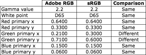
Another contributing factor to the confusion is the option on a digital color camera to choose an RGB color space (e.g., sRGB, Adobe RGB (1998), or ProPhoto RGB) for the encoding of a photograph within the digital color camera. These RGB color spaces are convenient color spaces that simplify color management of a digital photograph downstream from the digital camera. Encoding a digital photograph in one of these RGB color spaces will constrain the digital photograph to the gamut of the color space (Yes, each of these RGB color spaces has a color gamut that is constrained by the colorimetric values of the red, green, and blue primaries of the color space). It will also tie the digital photograph to the white point of the color space and establish the digital resolution within the color space (e.g., 8-bits per channel or 16-bits per channel). But the selected RGB color space is not the color gamut of the digital camera. If this distinction is not obvious after you have read the entire blog post, please leave a comment and I will go into more detail.

I recognize that it is easier to understand color management when we can see the color gamut of each device displayed in the same color space. Unfortunately, we cannot display the color gamut of a digital color camera in CIELAB space, or the CIE xy chromaticity space, for comparison with the color gamut of a color monitor or a color printer because the digital color camera does not have a color gamut. I am sympathetic with the desire to give a digital color camera a color gamut in order to facilitate a comparison to color rendering devices. The good news is that we have a simple solution: device characterization with a common colorimetric color space (e.g., CIELAB).

In the practical application of a color management system, the characterization of a color-imaging device is the information that enables color management. This is true for any color rendering device and any color measurement device in the digital color workflow. The data within an ICC profile are based on characterization data, not the limits of a color gamut. The information taken from an ICC profile and rendered by software tools to visualize the color volume and boundaries of the color-imaging device is based on the characterization data. We should keep this in mind when someone incorrectly talks about the color gamut for a digital camera. We know that a digital color camera does not have a color gamut, but we can talk about the characterization of a digital camera, or the selection of a standard RGB color space within the camera, and frame the discussion in that context.

Post written by Parker Plaisted

References:
R. S. Berns, Billmeyer and Saltzman’s Principles of Color Technology, 3rd Edition, John Wiley & Sons, New York, N.Y. (2000).

International Color Consortium, ICC Profile Format Specification. (http://www.color.org)

Imaging FAQ on the RIT CIS Munsell Color Science Laboratory (MCSL) Website https://www.rit.edu/cos/colorscience/rc_faq_faq3.php#255

Comparison of Adobe RGB and sRGB Colors

Two of the most commonly used ICC profiles for RGB images are Adobe RGB (1998) and sRGB IEC61966-2.1. The Adobe RGB (1998) color space has a larger color gamut than the sRGB IEC61966-2.1 color space, but you may be surprised to see that they share many similarities.

In order to compare the two color spaces, I will use the CIE and ICC data that define the color spaces:

  1. Gamma value
  2. White point
  3. Red primary CIE chromaticity coordinates
  4. Green primary CIE chromaticity coordinates
  5. Blue primary CIE chromaticity coordinates

Adobe RGB and sRGB attribute values

As you can see in the table, Adobe RGB (1998) and sRGB IEC61966-2.1 share the same values for four of the five attributes. The only difference is the set of CIE chromaticity coordinates for the green primary.

Now let me show you two versions of a sample image. For the first image, the sRGB IEC61966-2.1 ICC profile was assigned to the image in Adobe Photoshop. For the second image, the Adobe RGB (1998) ICC profile was assigned to the image in Adobe Photoshop. (Note: To make sure you see a difference between the two images, I converted the second image from Adobe RGB (1998) to sRGB IEC61966-2.1 so that both images are coded to the same color space. Yes, I could have coded both of them in the Adobe RGB (1998) color space to make sure no colors got clipped. Feel free to repeat this experiment in a color-managed display environment to see the color differences.)

sRGB IEC61966-2.1 ICC Profile
food image sRGB

Adobe RGB (1998) ICC Profile
food image Adobe RGB

As you can see, the colors in the image with the sRGB IEC61966-2.1 ICC profile are significantly different from the colors in the image with the Adobe RGB (1998) ICC profile.

Based on the data comparison above, I would have expected the reds and blues to be similar in both images, and I would have expected the greens to be very different. However, the greens and blues have small shifts in color, and the reds and oranges have large shifts in color. Here is another set of images that demonstrates the color differences.

sRGB IEC61966-2.1 ICC Profile
park slide image sRGB

Adobe RGB (1998) ICC Profile
park slide image Adobe RGB

Why do we see these large color differences in the reds and oranges when the only difference in the two color spaces is the set of CIE chromaticity coordinates for the green primary? The answer can be found in the CIE XYZ tristimulus values for the red, green, and blue primaries.

sRGB IEC61966-2.1 CIE XYZ Tristimulus Values
sRGB CIE XYZ tristimulus values

Adobe RGB (1998) CIE XYZ Tristimulus Values
Adobe RGB CIE XYZ tristimulus values

The two color spaces share the same CIE chromaticity coordinates for the red and blue primaries, and share the same D65 white point and 2.2 gamma value, but the two sets of CIE XYZ tristimulus values are completely different.

To fully understand the differences when the images are viewed with proper color management, we have to look at the 3×3 matrix in the ICC profile. As I described in an earlier post, a chromatic adaptation transform must be applied to the CIE XYZ tristimulus values to force the 3×3 matrix to deliver the D50 white point that is required in the specification for ICC profiles. For the Adobe RGB (1998) and sRGB IEC61966-2.1 ICC profiles, the Bradford transform and proper von Kries scaling were used to move the white point from D65 to D50. The CIE XYZ tristimulus values in the 3×3 matrices are shown below.

sRGB IEC61966-2.1 ICC Profile 3×3 Matrix
sRGB ICC 3x3 matrix values

Adobe RGB (1998) ICC Profile 3×3 Matrix
Adobe RGB ICC 3x3 matrix values

The CIE XYZ tristimulus values in these two 3×3 matrices help explain the color shifts seen in the two sets of example images. Further analysis can be done with these two matrices to compare the CIELAB values associated with a given set of RGB pixel values.

The point of this post is to alert people to be careful when comparing color spaces in color managed workflows. It is convenient to compare RGB color spaces based on the CIE chromaticity coordinates of the primaries, but it is difficult to predict the color differences in color-managed images from a comparison of CIE chromaticity coordinates of the primaries.

Post written by Parker Plaisted

References:
International Color Consortium, ICC Profile Format Specification, http://www.color.org

M. Fairchild, Color Appearance Models, Addison-Wesley, Reading, Massachusetts (1998).

Bruce Lindbloom Website, RGB Working Space Information page, http://www.brucelindbloom.com

Chromatic Adaptation for Display Profiles

When I was working on improvements to the OptiCAL software in 1998, one of the challenges was the selection of the chromatic adaptation algorithm. At the time, the International Color Consortium (ICC) did not specify a chromatic adaptation algorithm, so each software developer could choose any method for chromatic adaptation.

Let me back up and give you a little more context for this issue. The ICC had specified CIE D50 for the white point of the Profile Connection Space (PCS). Therefore, all the color coding in the PCS had to have a white point of D50. That worked well for output profiles (e.g., printer profiles), but it created an extra step in the creation of display profiles (e.g., monitor profiles) and RGB color-space profiles when the native white point was not D50. That extra step was the application of a chromatic adaptation transform.

I will focus on an ICC display profile for a color monitor as an example. When the display profile is based on the matrix structure, rather than the LUT structure, the 3×3 matrix contains CIE XYZ tristimulus values for the red, green, and blue primaries. By following the rules of linear algebra, the sum of each row in the 3×3 matrix produces the CIE X, Y, and Z tristimulus values for the white point of the display (i.e., the sum of the top row delivers the X value, the sum of the middle row delivers the Y value and the sum of the bottom row delivers the Z value). To be compliant with the ICC specification, the 3×3 matrix must deliver the CIE XYZ tristimulus values of D50 for the CIE XYZ tristimulus values of white (i.e., white XYZ for the display profile = CIE D50 XYZ).

If the white point of the actual display is not D50, then a chromatic adaptation transform must be applied to the measured data to force the 3×3 matrix to deliver the CIE XYZ tristimulus values for D50. (Keep in mind that a display will rarely be calibrated to exactly D50, so a chromatic adaptation transform will be applied to the measured data even for a small deviation from D50.) In simple terms, the chromatic-adaptation transform changes the tristimulus values of the red, green, and blue primaries to produce a D50 white from the sum of the three primaries. The new tristimulus values for the red, green, and blue primaries are placed in the 3×3 matrix for the display profile.

Without a specification from the ICC for a chromatic adaptation algorithm (CAT), software developers were free to choose any chromatic adaptation algorithm. Some software developers simply used linear scaling on the measured CIE XYZ tristimulus values for the red, green, and blue primaries to force them to deliver the CIE XYZ tristimulus values of D50 for white. This technique is generally referred to as a “wrong von Kries transform” and the results are inferior to a proper von Kries transform. In 1998, the two popular chromatic adaptation transforms were the Hunt Pointer Estevez transform and the Bradford transform. Each of these three methods (i.e., linear scaling of the XYZ values, von Kries scaling with the Hunt Pointer Estevez transform, and von Kries scaling with the Bradford transform) produced different sets of XYZ tristimulus values for the 3×3 matrix, and, in turn, delivered different colors when used in a color management pipeline. At the time, most people using color management were unaware of this little detail in display profiles, and to this day I still encounter “color management experts” who are not aware of this little detail. Fortunately the ICC addressed this issue and now recommends the Bradford transform for Version 4 of the ICC profile specification. Software developers who create software applications that make ICC profiles should now use the Bradford transform in the software in order for the ICC profiles to be compliant with the Version 4 specification, but exceptions are allowed and can be implemented in the ICC profile and noted in the chromatic adaptation tag in the ICC profile. Let me quote Annex E in Specification ICC.1:2010 (Profile version 4.3.0.0):

The ICC profile format specification allows the use of different linear (matrix-based) CATs. This flexibility allows profile creators to select the most appropriate CAT for their applications. Criteria for selection include visual performance, the gamut of the image as transformed to the PCS, and other considerations. However, the use of different CATs will produce different results, which may be undesirable. Therefore, it is recommended that the linear Bradford CAT be used when there is no reason to use a different CAT. The linear Bradford CAT has been widely implemented in the digital imaging industry, with demonstrated excellent visual performance. If a profile creator decides to use a CAT other than linear Bradford, they should do so only to address specific known issues, recognizing that the resulting profile will most likely produce different results than profiles from other sources.

In 1998 I chose the Hunt Pointer Estevez transform based on discussions with colleagues who had significant experience with chromatic adaptation transforms (CATs) and were familiar with the Hunt Pointer Estevez transform and the Bradford transform. Working with Dana Gregory on the OptiCAL software, we implemented the Hunt Pointer Estevez transform for OptiCAL version 2.5. Five years later in 2003, the OptiCAL software was updated to use the Bradford transform for chromatic adaptation to conform to the Version 4 ICC Specification. The update to the OptiCAL software that incorporated the Bradford transform was clearly the right decision, and Michael Brill provided a detailed report on this update to the software in 2003.

I hope this post will elevate awareness of the presence of a chromatic adaptation transform in software that produces display profiles. I will visit this topic again in future posts to share additional insights on related issues that may be overlooked in color management workflows.

Post written by Parker Plaisted

References:
International Color Consortium, ICC Profile Format Specification. (http://www.color.org)

M. Fairchild, Color Appearance Models, Addison-Wesley, Reading, Massachusetts (1998).

The Reference White in Adobe Photoshop Lab Mode

In an earlier post I explained that all CIELAB values are relative to a reference white, and one benefit of the reference white is the chromatic adaptation provided by dividing each CIE XYZ tristimulus value of the stimulus by the corresponding CIE XYZ tristimulus value for the reference white.

For this post I will focus on two example implementations of the CIELAB color space in digital color workflows and the reference white used in each example.

The first example implementation is color management with device profiles based on the International Color Consortium (ICC) specification. The reference white for every ICC profile is D50, and the corresponding CIE XYZ tristimulus values are X = 0.9642, Y = 1.0000, and Z = 0.8249. This information is provided in the description of the ICC Profile Connection Space (PCS) as guidance for interpreting PCS values that are encoded as CIELAB values. The following statement is a quote from ICC Specification ICC.1:2004-10:

So, in summary, the PCS is based on XYZ (or CIELAB) determined for a specific observer (CIE Standard 1931 Colorimetric Observer – often known colloquially as the 2 degree observer), relative to a specific illuminant (D50 – a chromatic adaptation transform is used if necessary), and measured with a specified measurement geometry (0°/45° or 45°/0°), for reflecting media.

Note that the ICC PCS values may be encoded as CIELAB values or CIE XYZ values, but the CIELAB encoding is preferred for output device profiles that characterize printing systems. The use of D50 for the reference white for CIELAB encoding in the ICC PCS makes the CIELAB values more suitable for printing systems than other white points (e.g., D65) because D50 is the standard illuminant for prepress proofing and matching press sheets to proofs. Therefore, the reference white for the ICC PCS matches the reference white universally used for evaluating color proofs and finished color prints.

The second example implementation is the Lab color mode in Adobe Photoshop. The Lab color mode is based on the CIELAB color space, and the reference white for the Lab color mode is D50 (confirmed by personal communication with a color scientist at Adobe). The Adobe Photoshop software has been widely used in graphic-arts prepress workflows since the early 1990’s (I began using Photoshop in 1993 in prepress applications); and Adobe was a founding member of the International Color Consortium when it was formed in 1993. Therefore, Adobe’s choice of D50 for the reference white for the Lab mode is consistent with Adobe’s support of the ICC profile specification, which I just described above, and the widespread use of Photoshop in graphic-arts prepress workflows where D50 is the standard illuminant for evaluating prints.

Both of these example implementations are relevant to digital color workflows used by photographers to produce photographic prints, and it should be clear that D50 is a good choice for the reference white when the CIELAB values are used in a workflow that ends with a print. But there is another component that is generally present in a digital color workflow, and that component is the color monitor on which the color image is evaluated before the image file is delivered to a printer.

In my next post I will present my position in the debate on the preferred white point for color-monitor calibration in a digital color workflow where an image on a color monitor will be compared to the same image on a print.

Post written by Parker Plaisted

References:
International Color Consortium, ICC Profile Format Specification. (http://www.color.org)

Note: I spent a significant amount of time looking for an official Adobe publication or document that would confirm the rumor that the reference white for the Photoshop Lab color mode is D50, but I could not find one. I then called a friend at Adobe who is one of the color scientists at Adobe who is familiar with this detail in the Lab color mode. He confirmed that D50 is the reference white for the Lab color mode in Adobe Photoshop.